Some companies even have dedicated Slack channels for finding existing designs.
Beyond the challenging work of designing an interface, many designers spend a surprising amount of time on something that shouldn’t be so hard: finding an existing design. At Figma, we noticed our own designers were losing time trying to track down source files when they only had a screenshot, evidenced by hundreds of messages in Slack with designers asking teammates for help. That’s why we launched AI-powered search at Config 2024.
Visual search lets you search using a screenshot, selected frame, or even a quick sketch. Semantic search taps AI to understand the context behind text-based queries—even if you don’t know the exact terms for a component name, description, or file.
In retrospect, visual search and semantic search seem like obvious features to build. But getting AI features right—ones that go beyond the hype and truly add value—takes time. In our case, it took months of scoping and testing.


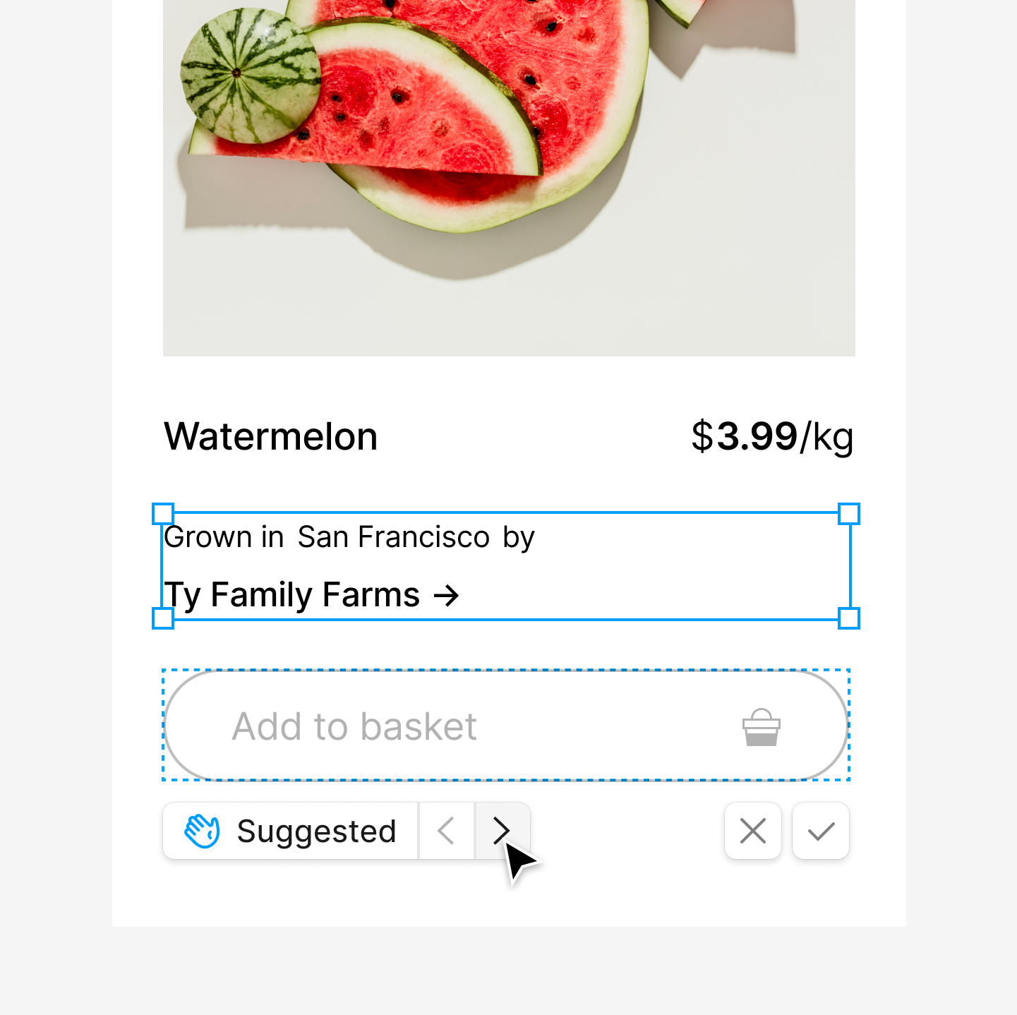
A feature like design autocomplete could help someone stay in the flow by recommending the next component.
We believe that AI should tackle the rote parts of your job, freeing you up to do more higher order thinking and focus on user needs. With this in mind, we kicked off a three-day AI hackathon in June 2023. By the end of our sprint, we had 20 completed projects, including a particularly ambitious one with a working prototype: design autocomplete. This AI assistant would suggest components—like a “Get started” button for an onboarding flow—as you work. There was so much momentum that we immediately added it to our product roadmap and set out to build it.
Our first step was to share the working prototype with internal teams and interview designers who used it in user research sessions. As we iterated on the feature based on their feedback, we started to build in parallel the foundations of AI search to power it behind the scenes. We knew based on Retrieval Augmented Generation (RAG) that we can improve AI outputs with examples from search; if design autocomplete could find designs similar to what a designer was working on, it could better suggest the next component.
As we iterated on autocomplete based on internal feedback and testing, consistent patterns emerged. For example, when starting a project, designers don’t just start from scratch—they constantly riff on existing work. They revisit past explorations, dig up old ideas, and use them to push their own work forward. In fact, 75% of all objects added to the Figma canvas come from other files. The problem is that finding these designs often requires knowing organizational structure and who has worked on what, eating up time and disrupting their flow. We wondered: Is autocomplete the right focus area, or should we first ship these search features?
Before answering that question, we turned our attention to how we might improve search, rooted in designers’ workflows and behaviors. We identified two key workflows that we would need to solve for: exploration mode, when designers brainstorm solutions to user problems, and execution mode, when they’re trying to get something on the canvas fast.
Designers oscillate between these modes, so we needed to tackle two main issues:
- Design elements aren’t always discoverable at the right altitude. Previously, designers had to choose between searching through low-level components in design system libraries or opening entire files for a specific screen. Finding something in between—like a frame combining several components—would be time consuming and disruptive to their creative flow.
- It’s hard to tell if a search result is relevant from a thumbnail alone. Without knowing if a result has the right design or latest version, designers have to open the file to check—rather than quickly scanning thumbnails.
This research made it clear that search was a meaty problem. While autocomplete could wait, better improved search and navigation couldn’t.
We knew we needed a focused approach that would deliver value while setting us up for future features like autocomplete. Our research pointed to three core use cases:
- Frame lookup, in which a designer tries to find a specific design to edit and riff on
- Frame variations, in which a designer is searching for different ways to design a particular piece of UI, either from prior explorations or existing patterns that utilize approved assets
- Broad inspiration, in which a designer is looking for thematically similar concepts and different approaches to give them a jumping off point
We decided to start with the more common search needs tied to creation, like finding exact designs, before tackling less frequent ideation use cases like exploring options at the project kickoff. This let us build on existing user habits and learn faster. We also wanted to tap into established AI research, such as reverse image search, to deliver value to our users quickly. To share our vision with the rest of the design team, we built an end-to-end prototype showcasing this improved search.
We quickly learned we couldn’t index and search everything—it would be too costly. Knowing that designers often pull from past work when starting a new design, we focused on surfacing top-level frames that look like UI designs. What we didn’t anticipate was that designers often organize their work in sections or other frames—making it tricky to spot UI designs. We solved this using heuristics like looking at common UI frame dimensions, and considering non-top level frames if they met the right conditions.
But identifying UI designs in a file was still unwieldy. Designers sometimes riff by duplicating and tweaking work, meaning many pages with similar designs. By making only one of those designs searchable—instead of every duplicate—we could trim down the sheer volume. The same went for files: Designers frequently copy files, so we could skip indexing those unaltered copies too.
We’re still experimenting with different approaches. One direction we’re testing is creating “quality signals,” like whether a frame is marked ready for development.
Lastly, we needed to create a hierarchy for the UI designs within a file. We found that as designers work, some designs are polished and ready to share, while others exist on pages called “Graveyard.” We needed to surface the former without dredging up archived designs. One quick fix was to hold off on indexing designs until we knew that a designer was done tinkering; we’d only index once a file hadn’t been edited for four hours. That approach kept unfinished work out of search results and increased the chances of surfacing completed designs. It also eased the load on our systems.
To get an AI model up to snuff, you measure its performance on “evals,” tests that capture how well your model does at a particular task across various situations. For us, that meant checking search result quality for typical queries. We picked our eval queries by talking to internal designers and analyzing how people used Figma’s file browser. A designer might search for something as simple as “checkout screen,” as descriptive as “red website with green squiggly lines,” or as specific as “project [codename] theme picker.”
To address the full spectrum of designer needs, our solution had to deliver relevant results across the board—from exact matches to highly similar results to somewhat different options. The feature wouldn’t cut it unless we could serve up high-quality results at different similarity levels. Our research showed that users prefer to start with something closer or more similar, even when ultimately seeking diverse results. In other words, if we couldn’t prove we could find the needle in the haystack, designers wouldn’t trust the feature for broader exploration.
Using our public plugin API, we built a tool for grading search results on an infinite canvas. We even added keyboard shortcuts to make labeling a breeze.
Once we tackled unforeseen challenges and settled on our quality approach, we zeroed in on design. While it would be simpler to build for a linear workflow—a designer moving neatly from exploration to execution—reality is messier. Designers oscillate between modes as they progress from start to finish. Rather than trying to guess which mode they’re in and when, we decided that Figma would offer a range of results and let users pick what most fits their needs. We focused on creating a unified interface for refining search results, regardless of input type. We added features like ‘created by’ filters and metadata—such as which file, by whom, how recently it was edited.
Throughout the design process, we explored tons of concepts. One idea we called “rabbit holing” let designers dive deeper into a result type by clicking on it. We ultimately scrapped it to keep the Actions search experience straightforward.
As other teams at Figma explored a single home for AI features—the new Actions panel—we realized it was the perfect location for our improved search. But this decision brought unique design challenges. The Actions panel, for instance, offers less space for search results than the file browser. So we added design details like “peek” for quick previews, while letting designers hit CMD + Enter for a full-screen look at a result.
After months of iterative development, including a closed beta and continuous refinement using our eval plugin, we were ready for a broader launch. Looking back, shipping this work was guided by four key principles:
- AI for existing workflows: We applied AI to streamline tasks that users already perform, like file browsing and copying frames into their current file.
- Rapid iteration: We continuously shipped updates to our staging environment, using insights from our internal beta to refine features.
- Systematic quality checks: We developed custom evaluation tools to monitor and improve search result accuracy.
- Cross-disciplinary teamwork: Our success stemmed from close cooperation across product, content, engineering, and research.
As we look to the future, we’re excited about the potential to build on these search features. Our roadmap includes plans to bring visual and semantic search to the Figma Community. By focusing on real user problems and fine-tuning based on feedback and data, we’ve laid a solid foundation for AI-powered design tools that genuinely improve the creative process. We can’t wait for you to try it out and more easily find what you’re looking for.
Thank you to the many teams across Figma for the help in bringing these features to life, and to Spencer de Mars, Augustus Griffin, and Rohun Golkar for contributing to this article.


