When we think of national parks in the U.S., we think of natural grandeur: the granite cliffs of Yosemite, perhaps, or the twisting canyons of Zion. The National Park Service (NPS), however, manages 431 units of staggering diversity—some as small as the one-room Thaddeus Kosciuszko National Memorial in Pennsylvania. Helping people discover and navigate its wide ranging locales has been a foundational goal and challenge since the early 1900s, when the NPS began printing park brochures as visitor guides.
Things have shifted in the digital age. In 2016, the NPS tapped studio GuideOne to develop separate apps for each park before deciding to consolidate them in a single NPS app, which launched in 2021. With such an extensive park system, building out a unified app is no small endeavor. “It’s complex to manage because there are so many parks in control of their data and that write their own narrative,” says Juan Sanabria, Founder of GuideOne. “To bring that all into one system that works for everyone is a big challenge.” Other key considerations are durability and accessibility, says his collaborator Kevin Twohy, Founder of design practice Twohy Design Works: “An interesting aspect of government software is that it’s going to last for a long time, and tons of people with different accessibility requirements are going to use it.”
To chart a path forward, Juan and Kevin looked to the past—specifically Massimo Vignelli’s iconic Unigrid System, which codified the design and production of park brochures. Along the way, Figma allowed for easy circulation among collaborators, including the NPS and GuideOne’s development team, which gave feedback on what was feasible in terms of park data and engineering. The result is a robust app that serves both those venturing into our national parks and the employees who are stewards of them.
With the Federal Design Improvement Program in 1972, the U.S. government pushed agencies like the NPS, NASA, the USPS, and the EPA to modernize their design standards.
For most of its history, NPS brochures sported motley design styles in various formats. That changed in 1977, when the organization tapped acclaimed designer Massimo Vignelli to create a system standardizing both graphic components and production for all its print publications.
His creation, the Unigrid System, not only made design and publication more efficient and economical, but also created a cohesive and recognizable identity for the NPS at a time when national parks were still foreign to many Americans. The Unigrid specifies a house typeface (Helvetica), preferred colors, map treatments, and illustration principles. It uses a broadside approach with an underlying grid—not fold lines—to organize content. The horizontal and vertical grid lines delineate 12 panels on each side of the sheet, allowing designers to arrange text, images, and maps in harmonious and scalable compositions. The Unigrid is so effective, in fact, that in 1985 it won a Presidential Design Award from the National Endowment for the Arts for “[fulfilling] the primary objective of a design system, reducing routine decisions so that effort can be concentrated on quality.”
To ensure accessibility, every page on the app is voiceover compatible with audio descriptions displayed by default.
The Unigrid, in which content modules act as design system components, was also a jumping-off point for designing the app. Juan and Kevin needed a template that could serve up basic information about amenities, fees and passes, news, and events—along with recommendations on what to see, things to do, where to stay, self-guided tours, AR experiences, and other features specific to each park. “There’s a massive range between the biggest and smallest parks in terms of content and scale,” says Kevin. “We needed one system to flex across all of them.” The app organizes park pages with a responsive grid system that lays out full- and half-size tiles depending on the content available.
Take, for example, Acadia National Park, which spans 50,000 acres on Maine’s Atlantic coast. Its page is well populated with images and features, including a map and list of its historic carriage road bridges and multiple visitor centers. The aforementioned Thaddeus Kosciuszko National Memorial, on the other hand, has a page that’s more sparse. “The staffing is much more limited, so there are no special features or tour programming,” says Kevin. “The tiles adapt down to the half size so it feels more full.” For the iPad experience, the two columns reflow as three columns.
In the spirit of the Unigrid, this templatized approach ensures consistent, beautiful designs even if content is scant, and without requiring each park’s staff to devise their own layouts. Park staff can easily upload images, text, and other assets to fill out each tile—essentially translating park brochures for a digital interface.
Park brochures have always served the crucial function of giving visitors the lay of the land, and the app is no different. Aside from the tile view, each park page features a floating action button that allows users to explore the area through a map view. Plus, users can click into individual tiles—such as where to go and what to do—and see a list of places or read a map. “One of the core challenges of designing for mobile is that some of the population is visual, and more comfortable looking at a map, and some are more verbal and list-driven,” says Juan. The ability to toggle between the two modes resembles the experience of reading a park brochure, where one side is primarily text, and the other side is primarily topographic. Users can also download maps for offline use, which comes in handy in places like Death Valley or Joshua Tree, where cell service is scarce.

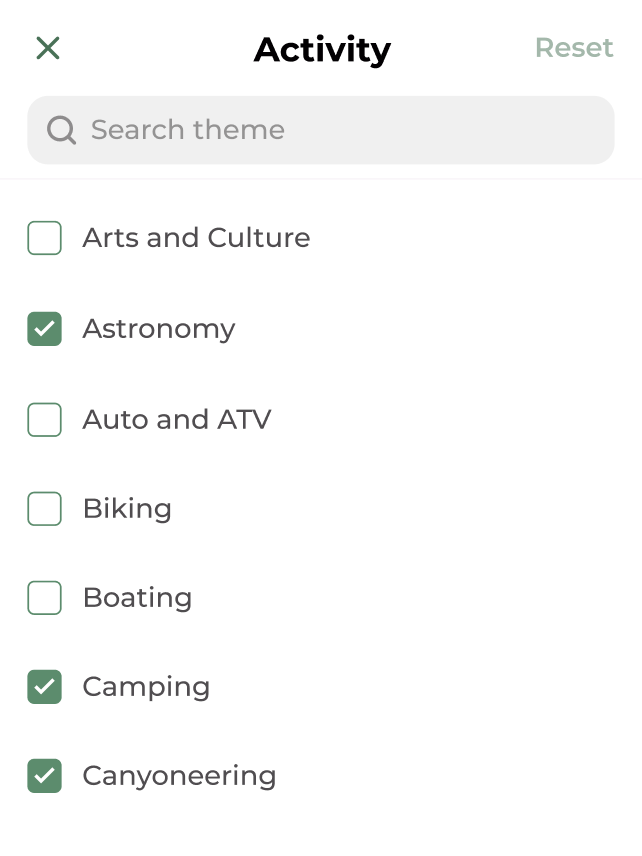
In the planning stages, users can discover and save places by browsing themes or activities like hiking, rock climbing, birdwatching, paddling, and stargazing.
In the same way that park rangers can suggest personalized itineraries or lead educational walks, the app also offers self-guided tours, some with audio narratives. In Acadia, for example, visitors can stroll past a series of wayside exhibits—informative signs posted outdoors—along Bass Harbor and Southwest Harbor.
Juan and Kevin are working with the NPS mapping team to bring in cartography from the Unigrid brochures in addition to default satellite maps. As part of a government entity with accessibility mandates, each individual park must supply audio descriptions before the maps can be included, which is a work in progress.
Park brochures disseminate crucial information, whether it be hazardous conditions, area closures, or anything else that may impact someone’s visit. In parallel, each park page features an alerts banner highlighting what travelers need to know; the added benefit is that unlike physical brochures that need to be reprinted and redistributed, parks can update the app in real time. Not all alerts are created equal, however. “An alert could say: ‘There are bison here, so be careful,’” says Kevin. “But it could also be a flash flood warning.” To address the difference between perennial updates and more urgent announcements, Kevin and Juan have been iterating on other ways to surface alerts that are still to come, from a floating alert button, to an alert tile on the home grid.
A recent addition to the app, AR experiences go beyond what a print brochure or wayside exhibit can offer. At Yellowstone National Park, for example, users can pull up a distance finder that helps visualize safe distances from bears, wolves, and other wildlife. At Antietam National Battlefield, you can see how troops moved over the fields during what’s known as “the bloodiest day in American History.” Juan notes, “There’s really nothing there physically, but AR brings its significance to life.” A project that’s currently underway will allow users to point their camera at Independence Hall and see the signing of the Declaration of Independence in motion.

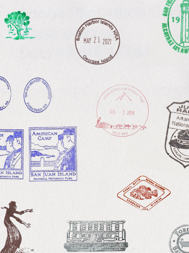
The app also provides passport stamp locations and images for each park, allowing collectors to see different ink stamp designs without having to leave home.
For Juan and Kevin, brainstorming and designing in Figma has streamlined the process of adding both visual polish and new features. It starts in FigJam, where Juan drops sketches and notes about new capabilities discussed with the NPS team, which stays involved from ideation, to iteration, to final decision. “The National Park Service has given us tremendous freedom to be creative, and we coordinate our efforts based on data feeds that are always getting updated,” says Juan. “They often suggest features and help nurture early ideas.”
Kevin then translates these sketches into wireframes or prototypes that everyone can iterate on. “The approach reflects how Kevin thinks in design and enables the process to go back and forth,” says Juan. “I can throw stuff in a messy FigJam, and it’s easy to push it through to more formal design files. The big picture is that a lot of these things happen in motion as we work, so it helps to communicate the idea.”
Prototyping along the way allows for quick experimentation. “Even if you’re only 20% done with a design, you can still make a prototype in Figma that feels 90% done,” says Kevin. “Before, making a prototype would take 90 minutes, so I would have just sent screenshots.” Figma also makes it easy to circulate designs and collect feedback from collaborators without having to manage file versions. “Figma has been an amazing change to our workflow,” says Kevin. Once a final design is set, GuideOne’s development team brings the vision to life.
Even if you’re only 20% done with a design, you can still make a prototype in Figma that feels 90% done.
“Even if you’re only 20% done with a design, you can still make a prototype in Figma that feels 90% done.”
With the NPS at the helm of a new user research initiative, insights about how visitors use the app before, during, and after their trip will continue to guide improvements. For example, the team assumed that most visitors started their research on the web before pivoting to the app once they’d arrived at the park. Younger visitors, however, rely entirely on the mobile experience. By popular request, users will soon be able to create accounts to save their favorite places, tours, photos, and more.
Unigrid brochures have been an enduring way to foster the relationship between park visitors and their passionate staff. By learning from their legacy, the NPS app invites a broader community and a new generation to experience and protect America’s cultural and historical heritage.


